
THERMADOR
Improved the usability & aesthetics of microwaves
It was essential that Thermador relaunch their microwaves to better meet the expectations of a luxury brand. To achieve this, we incorporated a full color display, giving us the opportunity to create a technologically advanced, yet familiar, user experience.
Role
Senior Product Designer
Responsibilities
Content Strategy, Information Architecture, User Flow, Wireframes, Prototyping, Visual Design, and QA
Prioritized frequently-used features
Functions such as setting a microwave time were brought to the forefront, while lesser-used features, such as setting the time of day or adjusting the screen brightness, were layered deeper within the user experience.
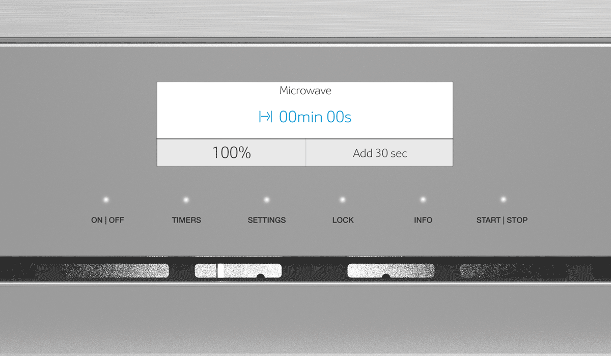
Microwave mode
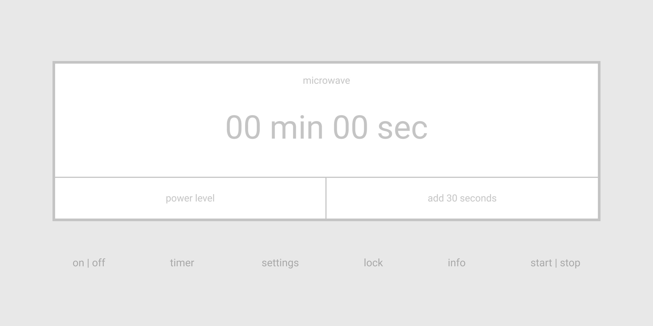

Setting a timer should be quick and easy
Minutes and seconds were separated into their own scroll wheel, similar to timers on mobile devices, to ensure a simple user experience.


Cook Assist mode
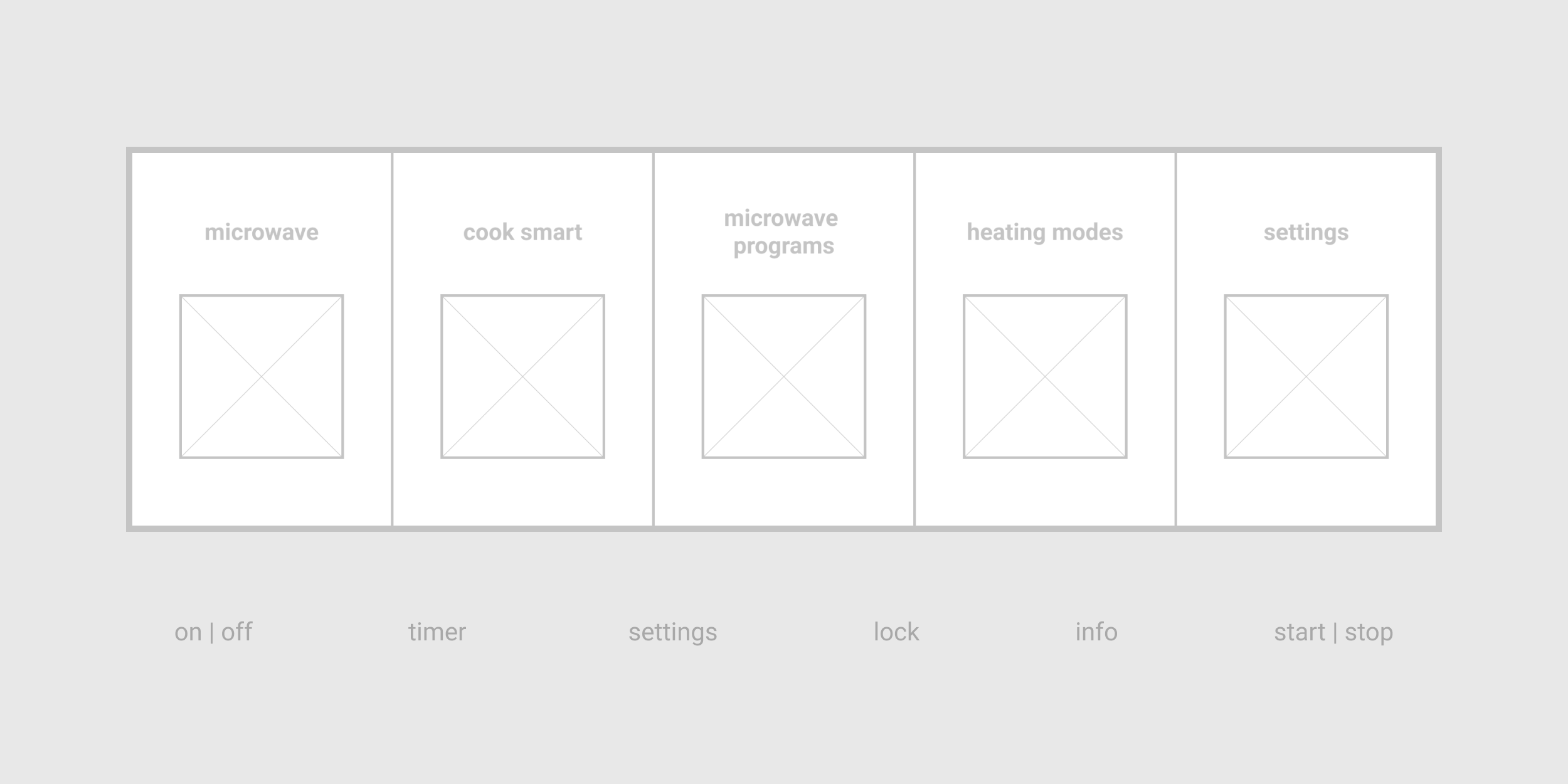

Encouraging consumers to use automated programs
Most consumers were unfamiliar with the new features being incorporated in this microwave line. To ensure users feel confident, the interface guides them step-by-step through the function.


Aligned to the Thermador visual design language
As design alignment was essential, we opted for the direction that best matched with the suite of Thermador appliances.
I generated and provided all design specification documents to the developers, including user journeys, wallpapers, animations, sounds, and assets.


